


DESIGN ・ DEVELOP ・ DELIVER
We believe in a minimalist philosophy, removing distractions to enhance focus. We minimize interface elements (i.e., images, animations, menu items, fonts, etc.) to deliver the core content—what visitors are looking for or what we want them to see.
We build websites with WordPress.org, leveraging its flexibility using selected themes, intuitive page builders, and strategic coding. This platform offers countless possibilities for design and functionality, allowing us to create websites that address any needs and objectives.
By applying this approach, we help site owners deliver their messages clearly and effectively, while ensuring visitors leave with a lasting impression of their unique style.
The Japan Writers Conference (JWC) is a free, annual weekend event that brings together English-language writers, translators, editors, and literary enthusiasts in Japan, hosted each year by a different Japanese institution. The website serves to engage both regular and new visitors, inform potential attendees, collect proposal submissions, and archive past conferences.
For the hero page, we selected a clean, geometric font for the JWC 2025 title, using a much smaller subtitle to inform visitors of the event dates. We kept the information minimal to encourage exploration—either via the header menu or by clicking the downward chevron at the bottom, which scrolls down to the news bulletin.
The interface elements are set against a campus photo of the hosting university. The lush, collegiate setting creates an inviting and professional first impression, reinforcing the conference’s educational and communal nature.
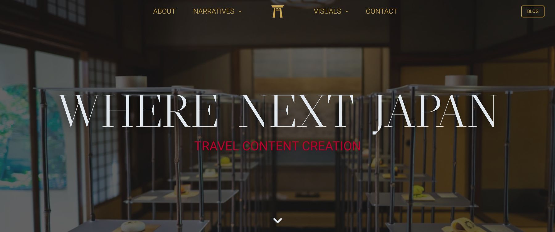
Felicity Tillac, the owner of Where Next Japan, is an Australian photographer, videographer, and storyteller who has been based in Japan since 2006. Blending written words and visual media, she captures life in her adopted country, documenting moments where cultures intersect and sometimes collide. To reflect this dynamic on the hero page, we combined contrasting typography, visual hierarchy, and the bold composition of Felicity’s photography.
For the title, we chose a modern serif font that balances calligraphic fluidity with chiseled angular details, positioning “Where Next Japan” almost as a question in white. Beneath it, a smaller sans-serif subtitle responds with “Travel Content Creation” in red, adding an element of urgency and tension.
The copy is set against a photograph taken in a Kyoto pastry shop, showing two rows of modern display shelves leading the eye toward an open door set within a traditional interior. Slightly to the right of the image center, the door hints at discovery and transition—an invitation to explore.
The main challenge with SayEdit.Com was introducing its three unrelated services on the hero page in a clear, engaging way. A direct explanation for each service would require too much text, distracting from the core message.
Our solution was to unify the services under a concise call to action. The subtitle beneath the main title achieves this by incorporating the mission statement—”We aim to simplify your tasks”—which applies to all three services. It also directs visitors to the bottom section, where each service functions as a navigation button.
To create a modern, minimalist aesthetic, we used a bold title font with a prominent period, set against a gradient background for visual interest without distraction. The symmetrical, flyer-inspired layout is subtly broken by the company logo in the top-left and the “@” contact tab on the middle-right, adding balance and guiding the eye naturally.
Know someone who needs editing? Refer them to SayEdit.Com and get a one-time discount on up to 3,000 words of basic editing at just ¥10 per word!
How it Works:
This discount applies to a complete short manuscript or any portion of a longer work.
Fast-track your publication with our Express Editing service, perfect for time-sensitive submissions and revisions.
We specialize in quickly and effectively integrating your changes and ensuring your responses to journal feedback are clear and fluent. Expect a rapid turnaround of 2-3 days for this service, allowing you to meet critical deadlines while maintaining high academic standards.
Ensure your manuscript is polished and submission-ready with our Basic Editing service, featuring two thorough rounds of expert review.
Each round typically takes 2–3 days; please allow up to one week for completion. Ideal for pre-submission drafts, our Basic Editing helps you present your research with confidence.
Know someone who needs editing? Refer them to SayEdit.Com and get a one-time
discount on up to 3,000 words of basic editing at just ¥10 per word!
How it Works:
This discount applies to a complete short manuscript or any portion of a longer work.
Fast-track your publication with our Express Editing service, perfect for
time-sensitive submissions and revisions.
We specialize in quickly and effectively integrating your changes and
ensuring your responses to journal feedback are clear and fluent. Expect
a rapid turnaround of 2-3 days for this service, allowing you to meet
critical deadlines while maintaining high academic standards.
Ensure your manuscript is polished and submission-ready with our Basic Editing
service, featuring two thorough rounds of expert review.
Each round typically takes 2–3 days; please allow up to one week for completion.
Ideal for pre-submission drafts, our Basic Editing helps you present your research
with confidence.